Power BI · Analytics & BI
Haven Warranty Analytics
From functional reporting to decision-focused analytics.
A synthetic Power BI warranty and claims analytics project exploring executive dashboard redesign, analytical decision-making and AI-assisted BI development.
View source on GitHub →The final dashboard
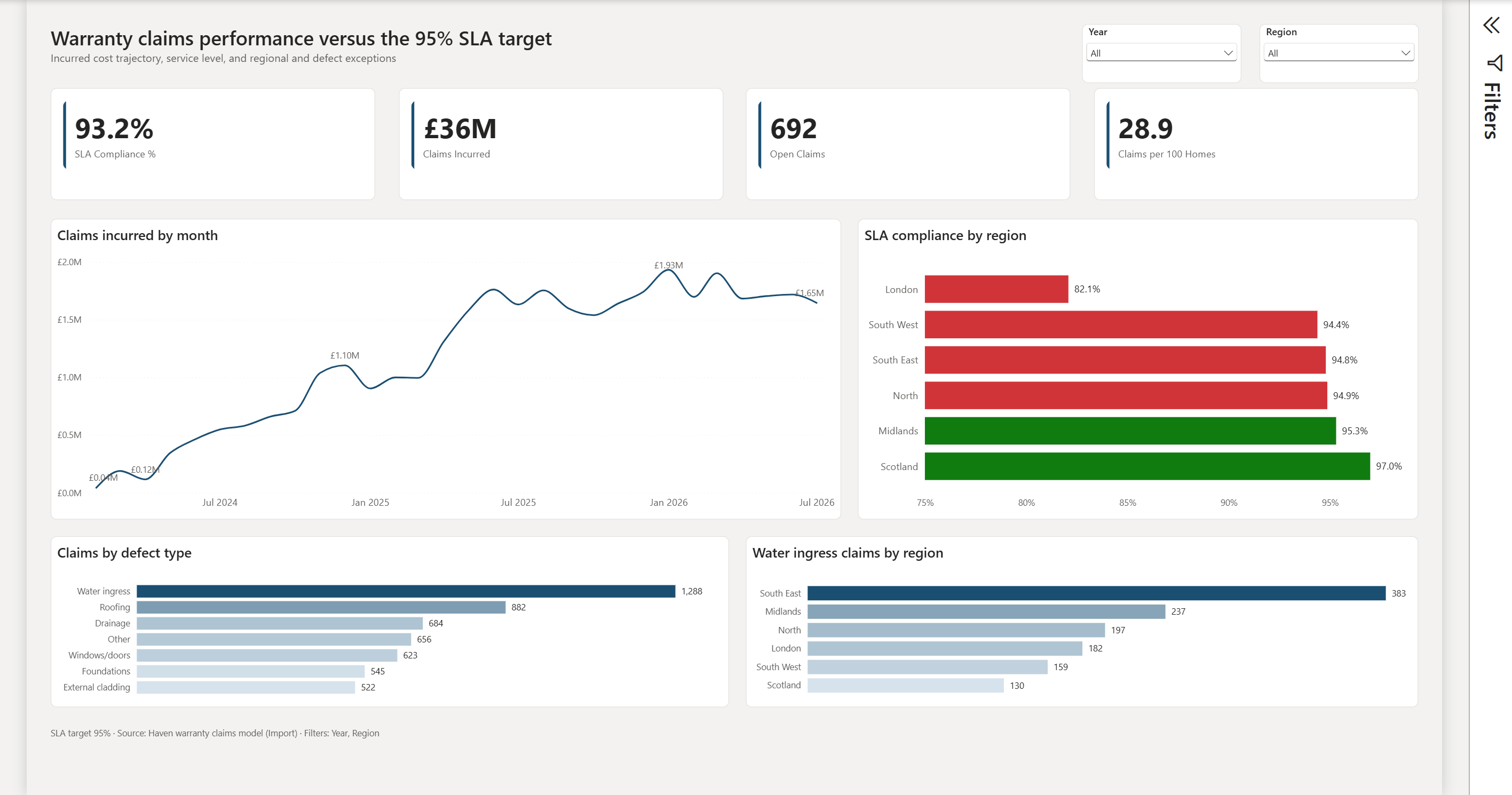
Final executive warranty analytics dashboard.
The project
Haven began as a functional Power BI warranty and claims dashboard. The objective was to redesign it into a clearer executive management view — improving KPI hierarchy, making service performance easier to interpret and surfacing exceptions that require attention.
The project also became an experiment in AI-assisted BI development: working directly with Power BI project source, iterating on visual and analytical decisions, testing implementations and retaining human judgement over what ultimately belonged in the dashboard.
The starting point
The original report contained the core information, but the visual hierarchy treated many elements with similar importance. The redesign focused on making the management questions clearer rather than simply restyling the existing report.
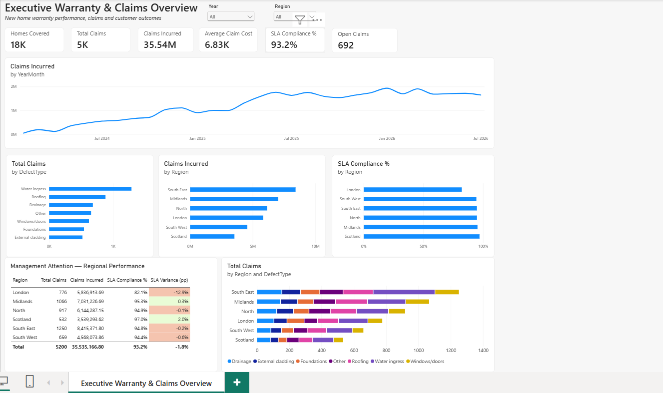
Original → AI redesign → Final
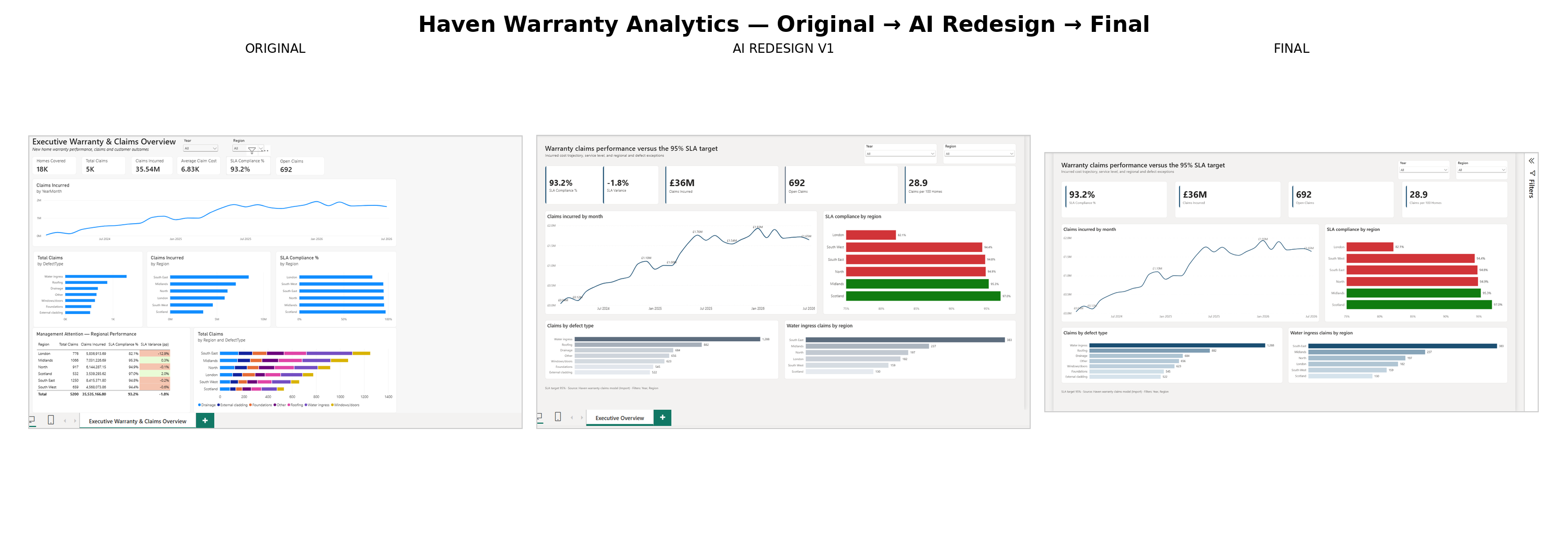
Original
Functional reporting and core measures established.
AI redesign
A strong first interpretation of the intended executive visual language and dashboard hierarchy.
Final
Analytical review, UX refinement and technical validation produced the finished dashboard.
AI accelerated exploration. Analytical judgement determined what survived.
What changed — and why
Simplified the KPI hierarchy
Reduced competing visual elements so the most decision-relevant measures became immediately visible.
Made the 95% SLA target explicit
Service performance was redesigned around a clear management reference point rather than treating SLA as background context.
Surfaced regional exceptions
Regional analysis was reframed to make underperformance easier to identify.
Introduced a more restrained visual language
Reduced visual competition and moved towards a clearer executive reporting style.
Clarified Claims per 100 Homes
The KPI was reviewed and corrected/clarified so that its displayed meaning matched the intended business interpretation.
When the visually attractive solution isn't the right solution
Clearly communicate performance relative to the 95% SLA target.
Different approaches were tested for dynamically displaying SLA variance.
Some implementations were visually attractive but proved technically unreliable or awkward within the Power BI implementation.
Reject the fragile implementation rather than retain it purely for visual effect.
Reliable analytical communication matters more than decorative cleverness.
Under the dashboard
The project was developed using Power BI's source-controllable project format, allowing the report and semantic model to be inspected and iterated on as code and structured metadata rather than only through the Power BI interface.
Power BI
Report development and visualisation
PBIP / PBIR
Source-controllable project and report definitions
TMDL
Semantic model definition
DAX
Measures and analytical logic
Synthetic CSV data
Reproducible public dataset
Git / GitHub
Version control and public source
An AI-assisted BI development workflow
AI was used to inspect project structure, support source-level changes, explore redesign options and accelerate iteration. The analytical requirements, KPI definitions, UX decisions, technical acceptance and final validation remained human decisions.
AI accelerated
- Project inspection
- Implementation
- Iteration
- Exploration
Human judgement owned
- Business meaning
- KPI definitions
- Analytical hierarchy
- UX decisions
- Technical acceptance
- Final validation
What the project demonstrates
Power BI development
Dashboard development, semantic-model awareness and DAX.
Data visualisation
Information hierarchy, KPI prioritisation and exception-led reporting.
Analytical judgement
Reviewing metric meaning rather than simply accepting existing calculations.
Modern BI development
Source control and PBIP/PBIR/TMDL workflows.
AI-assisted delivery
Using AI to accelerate development while retaining analytical and technical ownership.
Lessons
- Strong BI design starts with decisions, not decoration.
- Visual polish cannot compensate for ambiguous metrics.
- AI is highly effective for exploration and iteration.
- Generated solutions still require technical validation.
- Source-controlled BI makes AI-assisted development substantially more powerful.
Related experiment
Bridges to Prosperity — Tableau
A parallel AI-assisted BI experiment exploring how far the same source-level development approach could be taken with Tableau.